Design with Pantone’s Color of the Year
Design with Pantone’s Color of the Year – A look back at how the Color of the Year played out in Interior Design.
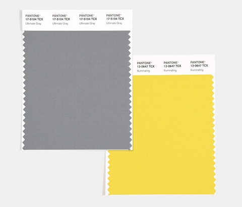
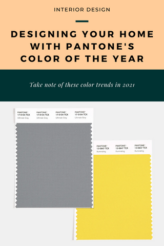
2021 is here and you know what that means… new Pantone Color of the Year choices! This year, we’re looking at Ultimate Gray and Illuminating Yellow. What does this mean for interior design trends? Heck! We don’t know but let’s look back at some of Pantones previous color trends to see how they fared.
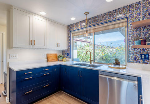
Singing the Blues – Pantone Classic Blue 2020
2020 failed at so many things but bringing this solid and dependable color back was a total victory. Blue is loyal, dependable, noble, and a classic! Cabinets are rocking this color and making rooms cheery and bold. I predicted this color will stick around for a while.
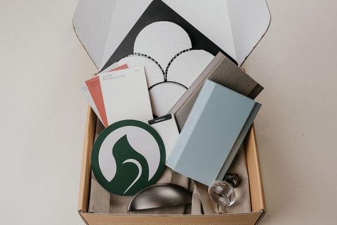
Coral – Pantone Living Coral 2019
Coral is beautiful and bright, but we don’t see it lasting. We used Living Coral as an accent color in our Astoria designer style box. It pairs with the grays and blues perfectly. Look for it in paint, rugs, pillows, and other inexpensive interior accents that can easily be changed when next fun color catches your eye.
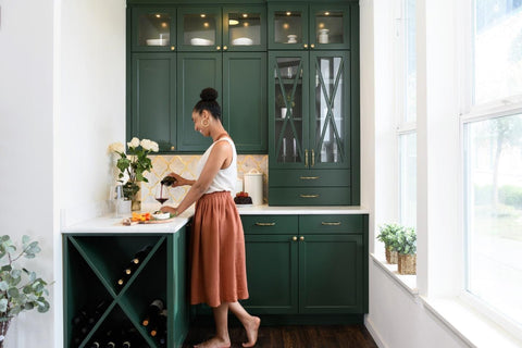
Go Green – Pantone Greenery 2017
We LOVE green, it has the ability to make you feel the future will be bright and beautiful filled with innovation and possibilities. It nods to the past and reminisces on ancient forests and old English libraries.
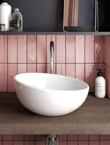
Pastels? – Pantone Serenity and Rose Quartz 2016
At first we had some major 80’s flashbacks with Pantone’s choice of Rose Quartz and Serenity. These are the pastel colors of childhood and we weren’t sure what to make of it. Then. We fell in love. The soft blue gray “Serenity” is a welcomed sight in kitchens and baths which are turning to a more lived in old world feel. I believe Rose is best served in small doses in unexpected places like this Bedrosian’s tile used as the backslash for a powder room.
Looking for more Interior Design Inspo? Come check out our Instagram!
